How to make Bar Charts with Zapier
In this example, we'll use the QuickChart Zapier integration to generate a bar chart.
First, select a trigger. This can be whatever you want - a new row in a spreadsheet, a new survey response or form submission, and more.
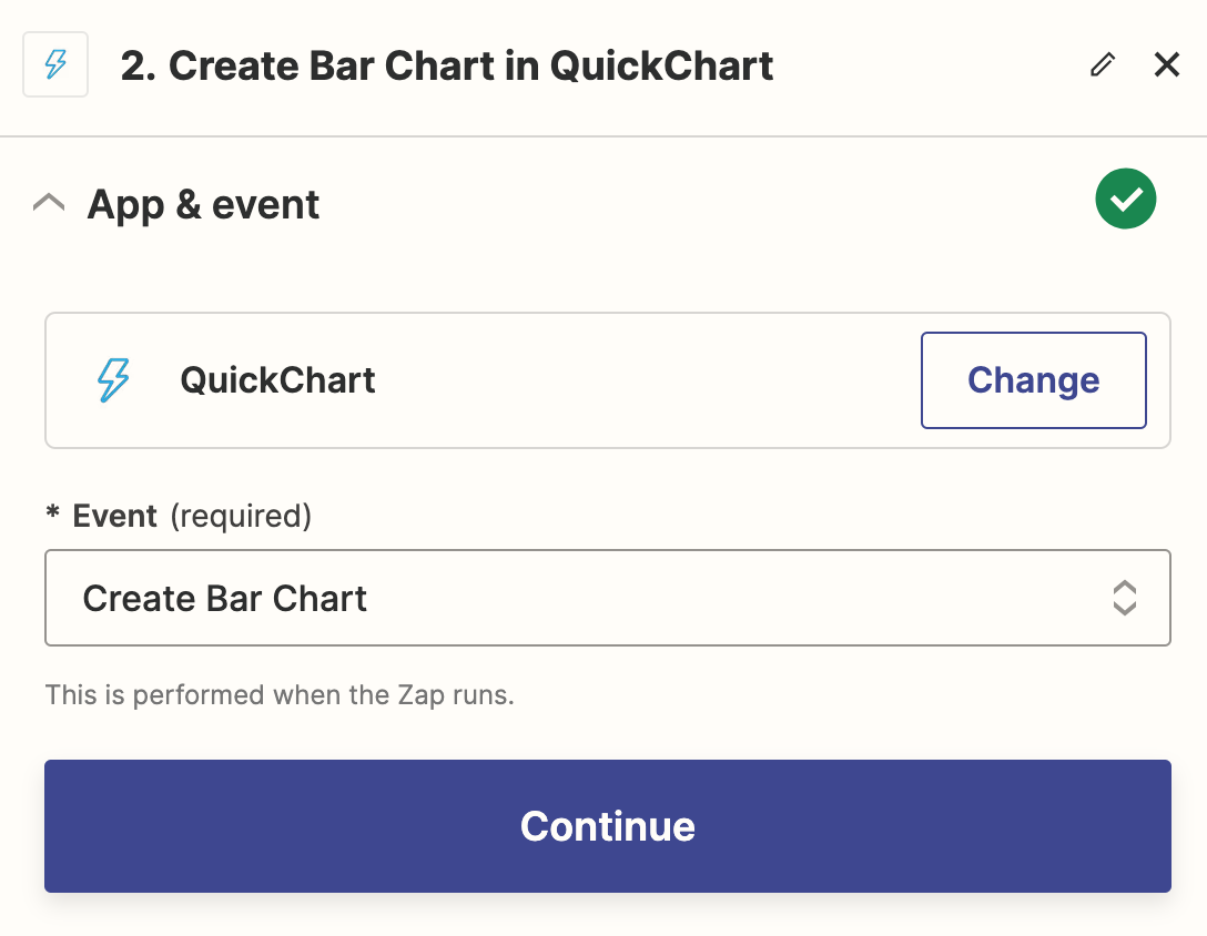
Select the Create Bar Chart event
After you've added the integration, select the Create Bar Chart event and click "Continue".
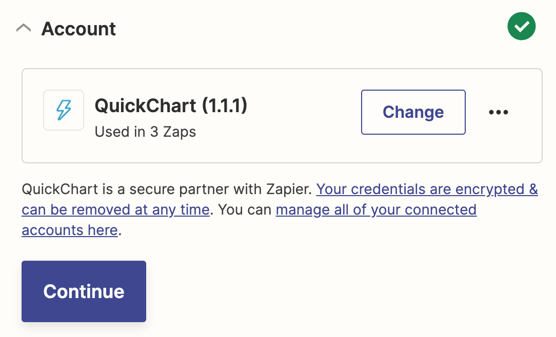
Set up the QuickChart credentials
QuickChart is free and you don't need an account. Click "continue". If prompted for a credential, just leave it blank.
Configure the bar chart
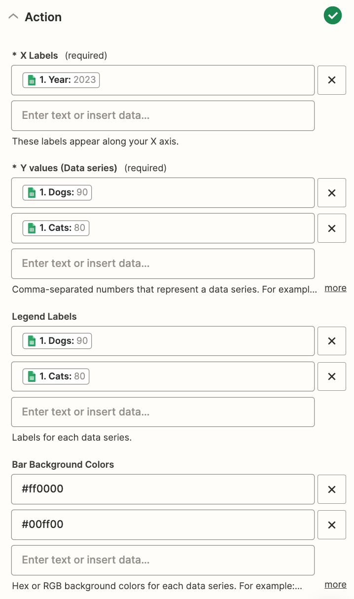
Now it's time to actually build the chart.
For X labels, create a list of labels you want to appear on the bottom of the chart. Each label will appear under a bar group. In the example below, the first value in each data series will be grouped under "Year: 2023".
For Y values, create a list of data series that you want to display. Each data series will have a distinct color. You can create multiple data series that will be shown as different bar groups.
For Legend labels, set the legend for each data series.
Other customization options are available as well.
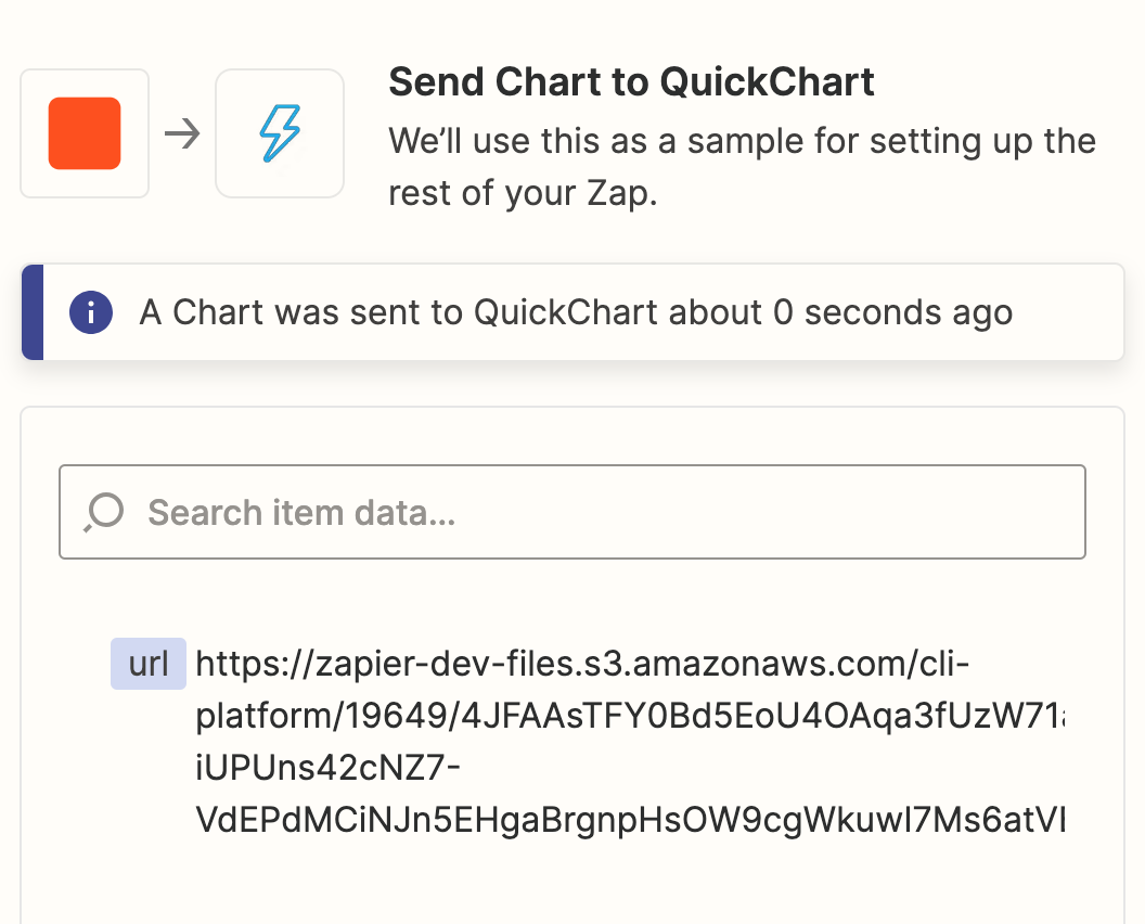
Test and run
That's it! You're ready to test and run your Zap. The Zap produces a result with a url property that looks like this:
If you load the URL, it will look like this:

Using the Chart Maker
The Zapier Bar Chart action is easy to use, but its flexibility is limited. To fully control what your chart looks like, use the no-code Chart Maker.
Using the Chart Maker, you can customize your bar chart however you like.
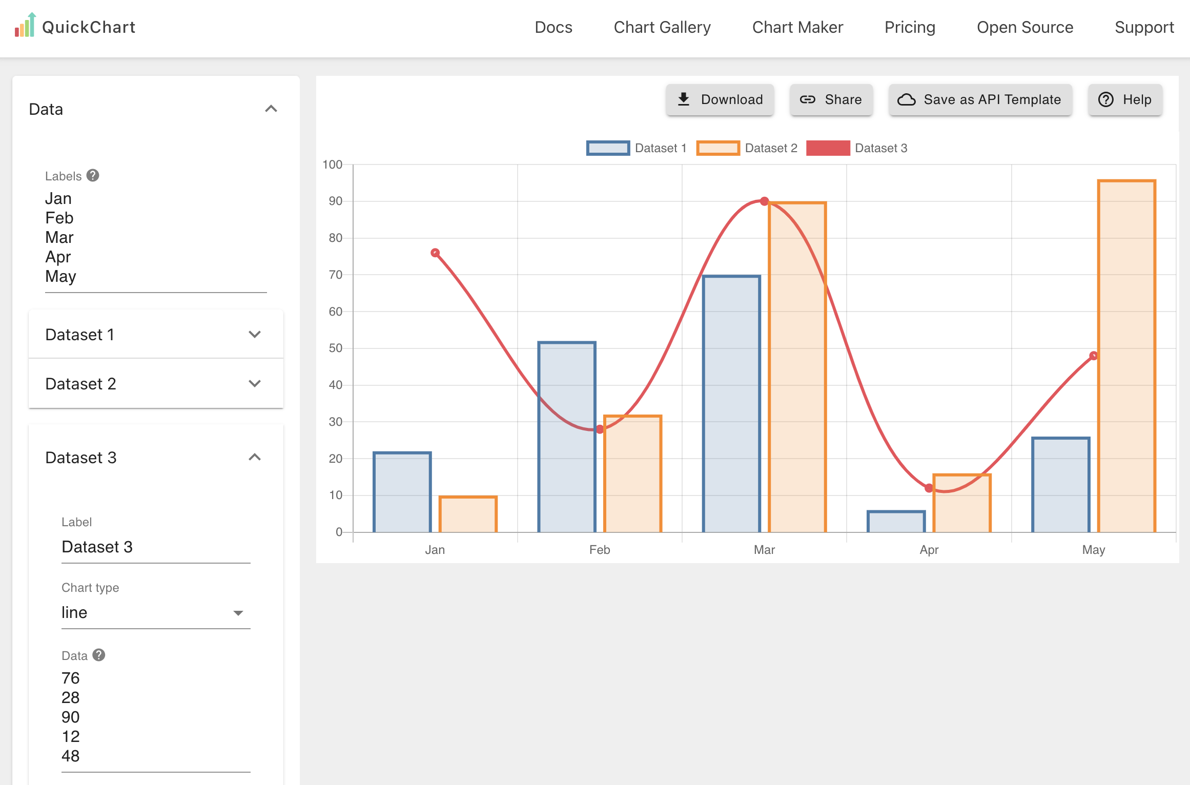
Click the Save as API template button in the top right corner. This will give you a special URL for your bar chart.
The URL will look something like this:
https://quickchart.io/chart/render/zf-abc-123?
From there, you can simply add your data to the URL to have it appear on the chart:
https://quickchart.io/chart/render/zf-abc-123?data1=30,60,90
For more information, see the custom values tutorial.
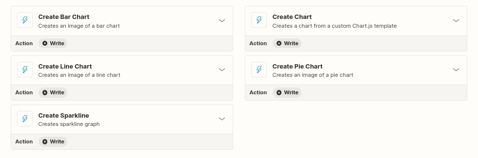
Other types of charts
The QuickChart Action on Zapier supports many other types of charts, including line, sparkline, and pie charts.
If you're looking to further customize your charts, see the full Zapier tutorial.
Need help?
The first step is to ask in our community, which we monitor every day. Feel free to contact me or contact support if you get stuck or have questions. We'll get back to you quickly!
