Dynamic charts using Google Sheets as a data source
QuickChart can render chart images based on the latest data from your spreadsheet. This post describes how to integrate Google Sheets as a data source for dynamic chart images.
The charts are rendered as images, meaning they are embeddable in websites, emails, reports, and anyplace else. Latest data is pulled in automatically - you don't need to change your chart configuration in order to update chart data.
Step 1: Build the sheet
I am assuming basic familiarity with Chart.js and the QuickChart renderer. To learn more about how to get started, check out the Getting Started guide.
Let's suppose we have a spreadsheet table that looks like this:
| Name | Usage count | Payment |
|---|---|---|
| Joe | 75 | 150 |
| John | 87 | 174 |
| Sam | 4 | 8 |
| Kathy | 56 | 112 |
| Arnold | 6 | 12 |
| Sarah | 52 | 104 |
| Timmy | 25 | 50 |
| Rachel | 98 | 196 |
| Jared | 52 | 104 |
| George | 20 | 40 |
| Dave | 86 | 172 |
| Jeffrey | 12 | 24 |
We want to create a chart that shows Usage count and Payment bars for each Name.
Begin by creating a Google Sheet and copy the data into it. You can also upload Excel spreadsheets to Google. The above example has been transferred into Google Sheets here.
Next, configure the sharing setting so that outsiders can access to it. To do this, click the green "Share" button in the top right, then click "Change to anyone with the link". After setting this correctly, it will say "Anyone on the internet with this link can view".
Step 2: Build the chart
Have a look at the URL for your spreadsheet. It looks something like this:
https://docs.google.com/spreadsheets/d/1qBJlbi200GozsP8W4gBGZOxuwKSYmBiiTH8olwx26E8/edit#gid=0
The bolded part is called the document ID. Take note of this doc ID.
Next, we'll construct our Chart.js configuration and add a custom plugin called googleSheets. Here's an example:
{
  type: 'bar',
  options: {
    plugins: {
      googleSheets: {
        docId: '121DpBzwABbNB7JO3--dXGTI3CE2LL1WwPHXKCYDdsKM',
        sheet: 'Sheet1',
        labelColumn: 'Name',
        dataColumns: ['Usage count', 'Payment'],
      }
    },
    legend: {
      display: false
    }
  }
}
docId tells the plugin where to get data from. The rest of the attributes are optional. Use labelColumn or dataColumns to override values in your chart configuration.
As an alternative to docId, you may simply paste the full URL to the sheet as a sheetUrl attribute.
| Attribute | Description | Example | Notes |
|---|---|---|---|
| sheetUrl | Google Sheets shareable URL | "https://docs.google.com/spreadsheets/..." | Required when docId is not set. Overrides docId and sheet |
| docId | Google sheet ID | "121DpBzwABbNB7JO3–dXGTI3CE2LL1WwPHXKCYDdsKM" | Required when sheetUrl is not set |
| sheet | Name of the sheet or the 0-based index of the sheet | "Sheet1" or "0" | Optional, defaults to first sheet |
| labelColumn | Column name that defines the labels for your data series | "Name" | Optional, defaults to labels in chart config |
| dataColumns | List of column names that defines the numeric data for each data series | ["Usage count", "Payment"] | Optional, defaults to labels in chart config |
| rows | Object that defines row criteria | {"limit": 20, "offset": 1} | Optional |
| rows.limit | Number of rows to take from sheet | 20 for first 20 rows, -10 for last 10 rows | If negative, will count from bottom. Defaults to unlimited |
| rows.offset | Number of rows to shift the table by | 1 to omit the first row. -5 to omit the last 5 rows | If positive, shift rows up. If negative, shift rows down. Defaults to 0 |
| filter.label | Predicate for filtering data by label | label => label !== 'Joe' | Return true to keep the row, return false to remove it |
Like any other QuickChart chart, we can pack this configuration into a JSON string and send it to the QuickChart endpoint at https://quickchart.io/chart:
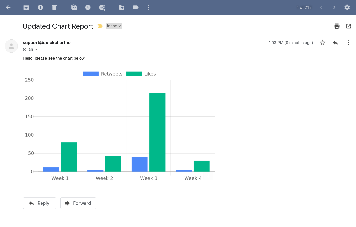
https://quickchart.io/chart?c={type:'bar',options:{plugins:{googleSheets:{docId:'121DpBzwABbNB7JO3--dXGTI3CE2LL1WwPHXKCYDdsKM',sheet:'Sheet1',labelColumn:'Name',dataColumns:['Usage count','Payment']}},legend:{display:false}}}When you render the above URL in an image tag, you'll see the image below:
<img src="https://quickchart.io/chart?c=..." />
This image can be directly embedded in on a website, email, PDF, etc. using a standard <img> tag. This image will update automatically as you update your spreadsheet. Note that updates can happen once every 30 seconds, and you must refresh the image to see changes.
It's best practice to URL encode the chart JSON parameter. Nearly every programming language has a built-in function to do this. URL encoding your JSON will avoid problems with more complex chart specifications.
Another usage example
You don't always have to override labels or use every data column in your spreadsheet.
Take this example chart configuration, which uses the same underlying spreadsheet as the previous example:
{
  type: 'bar',
  data: {
    labels: ['Person 1', 'Person 2', 'Person 3', 'Person 4', 'Person 5'],
    datasets: [
      { label: 'Total payments' }
    ],
  },
  options: {
    plugins: {
      googleSheets: {
        sheetUrl: 'https://docs.google.com/spreadsheets/d/121DpBzwABbNB7JO3--dXGTI3CE2LL1WwPHXKCYDdsKM/edit#gid=0',
        dataColumns: ['Payment'],
        rows: {
          limit: -5
        },
      },
      datalabels: {
        color: '#fff',
        font: {
          weight: 'bold',
        },
      },
    },
  }
}
In this configuration, we've chosen to anonymize the chart by omitting the labels from the Name column. We've also limited it to the last 5 data series. Note that the chart won't show data without an associated label (if you want to show data with no label, use an empty string).
Also, we purposely left out the Usage count column so that we show just a single Payment dataset. This dataset is labeled Total payments in the chart legend.
Finally, we've enabled the datalabels plugin. It's just one of many potential customizations we can introduce.
The end result looks like this:
Just as in the previous example, this image will automatically reflect the latest data in your spreadsheet when it is loaded.
Customizing chart series
In this example, we use a new "Temperature vs. Precipitation" dataset and split the datasets onto multiple axis, representing one with a bar and one with a line.
The spreadsheet looks like this (this data is on the "Weather" tab of the example Google Sheet we used above):
| Labels | Temperature | Precipitation |
|---|---|---|
| Jan | 33.37 | 1.59 |
| Feb | 28.75 | 6.47 |
| Mar | 47.58 | 3.52 |
| Apr | 54.48 | 15.32 |
| Mar | 74.49 | 15.92 |
| Jun | 86.29 | 19.69 |
| Jul | 83.1 | 11.2 |
| Aug | 88.29 | 19.88 |
| Sep | 66.06 | 4.08 |
| Oct | 57.79 | 6.18 |
| Nov | 54.56 | 10.7 |
| Dec | 45.05 | 12.73 |
We set the chart config like so:
{
  type: 'bar',
  data: {
    datasets: [
      {
        label: 'Temperature (F)',
        order: 2,
      },
      {
        type: 'line',
        label: 'Precipitation (inches)',
        yAxisID: 'y2',
        order: 1,
        fill: false,
      }
    ]
  },
  options: {
    plugins: {
      googleSheets: {
        docId: '121DpBzwABbNB7JO3--dXGTI3CE2LL1WwPHXKCYDdsKM',
        sheet: 'Weather',
        labelColumn: 'Labels',
        dataColumns: ['Temperature', 'Precipitation'],
      }
    },
    scales: {
      yAxes: [{
        id: 'y1',
      }, {
        id: 'y2',
        position: 'right',
        gridLines: {
          drawOnChartArea: false,
        },
      }]
    }
  }
}
We are rewarded with the following graph:
Filtering data
QuickChart supports dynamic filtering using the filter property.
For example, this configuration will display specific labels according to custom Javascript logic:
{
  // ...
  plugins: {
    googleSheets: {
      sheetUrl:
        'https://docs.google.com/spreadsheets/d/121DpBzwABbNB7JO3--dXGTI3CE2LL1WwPHXKCYDdsKM/edit#gid=0',
      labelColumn: 'Name',
      dataColumns: ['Usage count', 'Payment'],
      filter: {
        // Exclude Joe's column
        label: (labelName) => labelName !== 'Joe',
      },
    },
  },
}
Limitations
As noted above, charts will update at most once every 30 seconds.
The user must refresh the page or reload the image in order to see the latest spreadsheet data. Some clients cache images (for example, GMail caches images for about 48 hours on email open). In such cases, the chart may not update after caching has taken place.
Further reading
The look and feel of the chart is completely customizable using the Chart.js documentation. You should also see the QuickChart documentation for more information on shortcuts and plugins.
For starters, try replacing bar with line in the above examples to get a line graph instead of a bar chart!
If you're looking for shorter URLs, check out the URL shortener documentation.
QuickChart is open source for individuals and organizations that wish to self-host. Or, you can sign up for QuickChart in order to generate charts on our infrastructure. Feel free to reach out with any questions!
