Create charts from Airtable data
QuickChart is an open-source project for rendering charts. Generated chart images can be embedded in static locations such as websites, emails, PDFs, chat services, and many other places.
This guide shows how to create a chart that uses Airtable as a data source. Once you've connected a chart with Airtable, the chart will update automatically as data changes in the table or view.
Step 1: Put data in Airtable
I am assuming basic familiarity with Chart.js and the QuickChart renderer. To learn more about how to get started, check out the Getting Started guide.
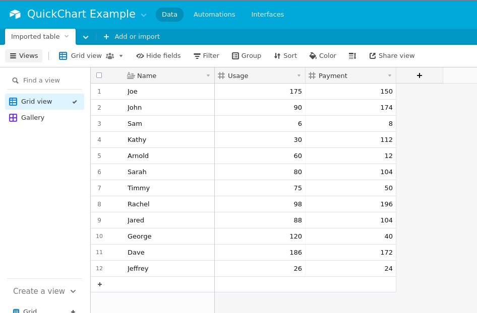
Let's suppose we have some data that looks like this:
| Name | Usage | Payment |
|---|---|---|
| Joe | 175 | 150 |
| John | 90 | 174 |
| Sam | 6 | 8 |
| Kathy | 30 | 112 |
| Arnold | 60 | 12 |
| Sarah | 80 | 104 |
| Timmy | 75 | 50 |
| Rachel | 98 | 196 |
| Jared | 88 | 104 |
| George | 120 | 40 |
| Dave | 186 | 172 |
| Jeffrey | 26 | 24 |
We want to create a chart that shows Usage count and Payment bars for each Name.
Begin by creating a table in Airtable and entering your data into it. I've reproduced the above example in Airtable here.
Note that you can also create a view of an existing dataset.
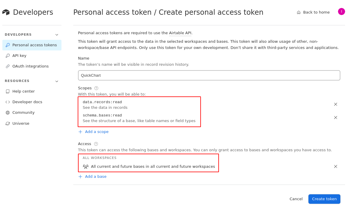
Step 2: Get your Airtable personal access token
In order for QuickChart to pull in your chart data, you'll need to provide a Personal Access Token.
To generate an access token, go to https://airtable.com/create/tokens.
Give it the following scopes:
data.records:read- See the data in recordsschema.bases:read- See the structure of a base
Then, grant it access to whichever bases you want to use data from. Or, grant access to all workspaces.
Step 3: Create the chart
Go back to your table and copy the Airtable URL from your browser. The URL should look something like this:
https://airtable.com/app25n6qlMCLecXGt/tbl8XldnwZE46uDUe/viwOAP1aFeL0INi0v?blocks=hide
Next, we'll construct our Chart.js configuration and add a custom plugin called airtable. Here's an example:
{
  type: 'bar',
  data: {
    datasets: [{
      type: 'line',
      label: 'Usage',
      lineTension: 0.4,
      borderColor: '#f82b60',
      backgroundColor: '#f82b60',
    }, {
      label: 'Payments',
      backgroundColor: '#19c0ff',
    }]
  },
  options: {
    plugins: {
      airtable: {
         apiKey: 'YOUR_AIRTABLE_API_KEY',
         url: 'https://airtable.com/app25n6qlMCLecXGt/tbl8XldnwZE46uDUe/viwOAP1aFeL0INi0v?blocks=hide',
         labelField: 'Name',
         dataFields: ['Usage', 'Payment'],
      }
    }
  }
}
👉 Edit the above configuration interactively in our chart editor.
The following parameters tell the plugin how to access your data:
apiKey: Airtable personal access token, required to connect QuickChart with Airtableurl: URL to Airtable, required to download data from the table
These parameters tell the plugin how to map the data onto a chart:
labelField: The field/column to treat as labels on the X-axis of the chart.dataFields: The field/column to treat as numeric data series on the chart.
Like any other QuickChart chart, we will URL-encode the configuration and pack it into the QuickChart endpoint at https://quickchart.io/chart:
https://quickchart.io/chart?c=%7B%0A%20%20type%3A%20%27bar%27%2C%0A%20%20data%3A%20%7B%0A%20%20%20%20datasets%3A%20%5B%7B%0A%20%20%20%20%20%20type%3A%20%27line%27%2C%0A%20%20%20%20%20%20label%3A%20%27Usage%27%2C%0A%20%20%20%20%20%20lineTension%3A%200.4%2C%0A%20%20%20%20%20%20borderColor%3A%20%27%23f82b60%27%2C%0A%20%20%20%20%20%20backgroundColor%3A%20%27%23f82b60%27%2C%0A%20%20%20%20%7D%2C%20%7B%0A%20%20%20%20%20%20label%3A%20%27Payments%27%2C%0A%20%20%20%20%20%20backgroundColor%3A%20%27%2319c0ff%27%2C%0A%20%20%20%20%7D%5D%0A%20%20%7D%2C%0A%20%20options%3A%20%7B%0A%20%20%20%20plugins%3A%20%7B%0A%20%20%20%20%20%20airtable%3A%20%7B%0A%20%20%20%20%20%20%20%20%20apiKey%3A%20%27YOUR_AIRTABLE_API_KEY%27%2C%0A%20%20%20%20%20%20%20%20%20url%3A%20%27https%3A%2F%2Fairtable.com%2Fapp25n6qlMCLecXGt%2Ftbl8XldnwZE46uDUe%2FviwOAP1aFeL0INi0v%3Fblocks%3Dhide%27%2C%0A%20%20%20%20%20%20%20%20%20labelField%3A%20%27Name%27%2C%0A%20%20%20%20%20%20%20%20%20dataFields%3A%20%5B%27Usage%27%2C%20%27Payment%27%5D%2C%0A%20%20%20%20%20%20%7D%0A%20%20%20%20%7D%0A%20%20%7D%0A%7D%0A
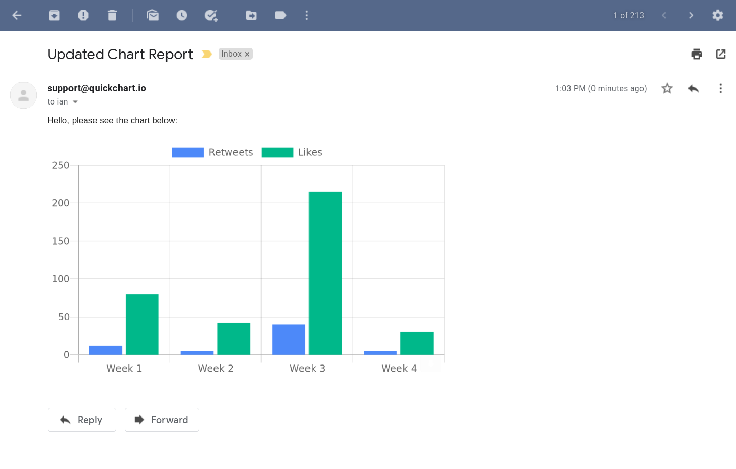
When you render the above URL in an image tag, you'll see the image below:
<img src="https://quickchart.io/chart?c=..." />
This data is being pulled directly from Airtable. If you update the data in Airtable, future chart loads will pull in the new data (there might be up to a 60 second lag).
This image can be directly embedded in on a website, email, PDF, etc. using a standard <img> tag.
It's best practice to URL encode the chart JSON parameter. Nearly every programming language has a built-in function to do this. URL encoding your JSON will avoid problems with more complex chart specifications.
Filtering data
QuickChart supports Airtable views, so you can always provide a filtered view url. QuickChart also supports dynamic filtering using the filter property.
For example, this configuration will display specific labels according to custom Javascript logic:
{
  // ...
  plugins: {
    airtable: {
      url: 'https://airtable.com/...',
      labelField: 'Name',
      dataFields: ['Usage count', 'Payment'],
      filter: {
        // Exclude Joe's column
        label: (labelName) => labelName !== 'Joe',
      },
    },
  },
}
Customizing your chart
QuickChart supports a huge range of charts and data visualizations. Pulling your data from Airtable will let you spread your data across nearly any digital format.
Have a look at the Chart Gallery to see what's possible. We showed a bar chart and a line chart above, but you can also do pie charts, radar charts, sparklines, financial charts, and much more!
You can also customize the look and feel of the chart. Refer to the documentation to learn how to customize titles, axes, tick marks, colors, labels, and more.
Because QuickChart is based on Chart.js, we also highly recommend using the Chart.js documentation as you're building the chart configuration. For starters, try altering the colors and labels in the Chart Editor.
Further reading
Feel free to reach out with any questions!
QuickChart is open source for individuals and organizations that wish to self-host. Or, you can sign up for QuickChart in order to generate charts on our infrastructure.
