How to create charts on Make
Make (formerly Integromat) is a platform that you can use to glue & script other platforms together. QuickChart offers a powerful no-code integration with Make.
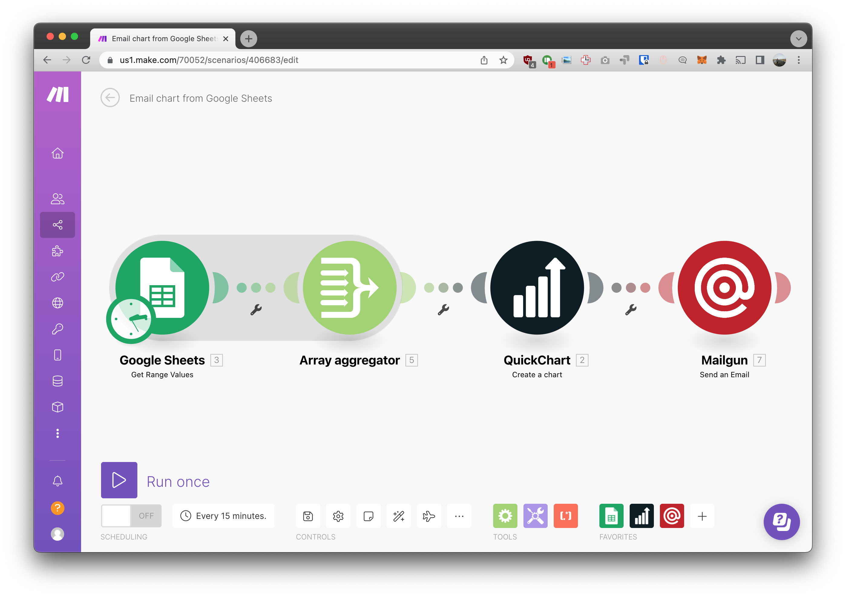
In this tutorial, we're creating an example scenario that pulls data from Google Sheets, creates a chart, and emails it. This scenario could be used, for example, to email a recurring report based on data in a spreadsheet.
Step 1: Set up the sheet
Create a Google Sheet with a table of your data. In this case, row is going to contain the X-axis label and the data associated with it. For example:
| Name | Usage count | Payment |
|---|---|---|
| Joe | 75 | 150 |
| John | 87 | 174 |
| Sam | 4 | 8 |
| Kathy | 56 | 112 |
| Arnold | 6 | 12 |
| Sarah | 52 | 104 |
| Timmy | 25 | 50 |
| Rachel | 98 | 196 |
| Jared | 52 | 104 |
| George | 20 | 40 |
| Dave | 86 | 172 |
| Jeffrey | 12 | 24 |
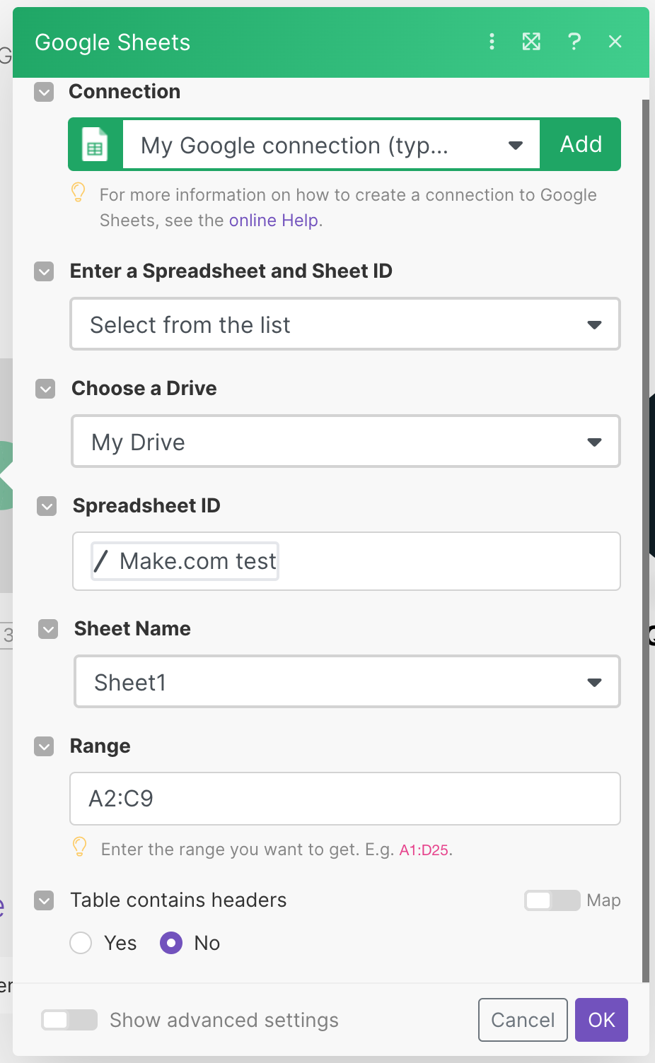
Add the Google Sheets "Get Range Values" action to your Make Scenario. For the purposes of this tutorial, I select the range that contains only data (A2:C9) without headers.
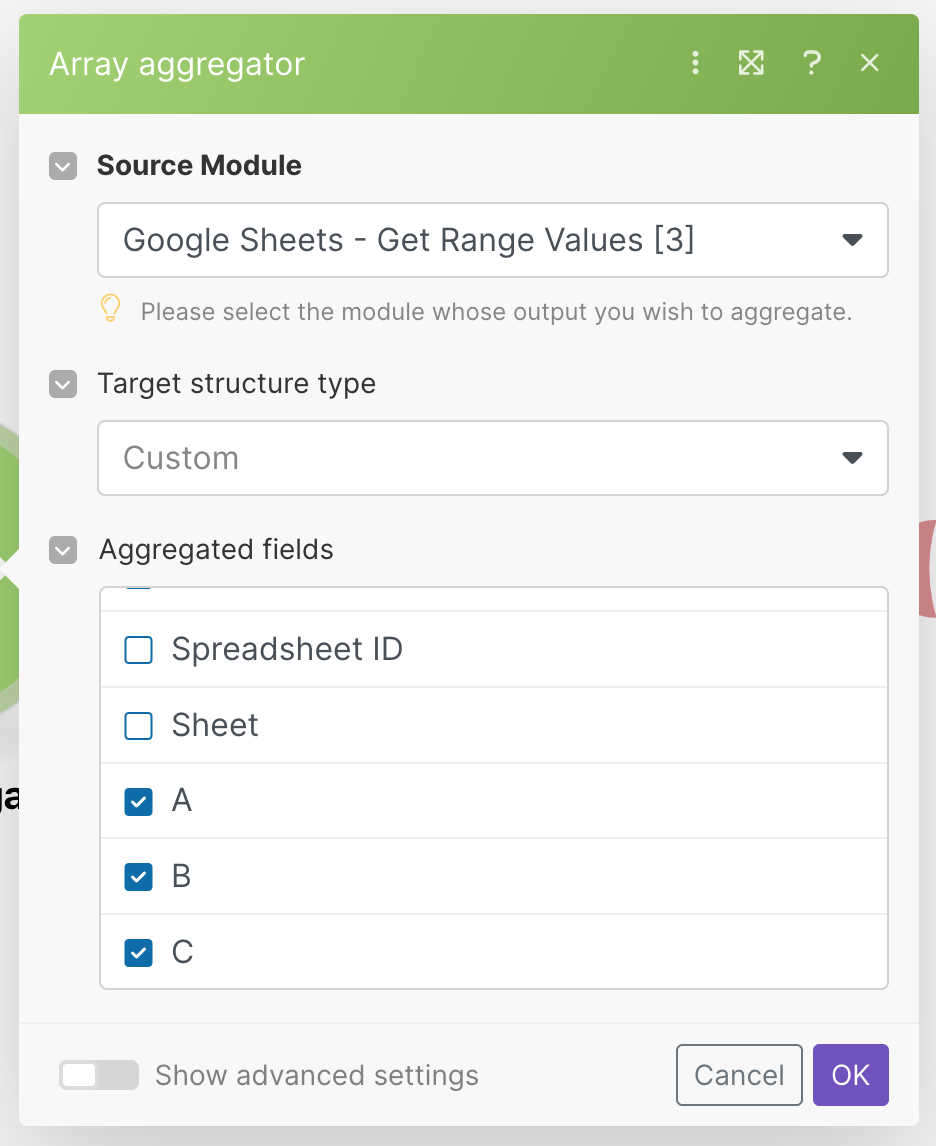
Step 2: Array aggregation magic
Next, use the Array Aggregator action to collect the values of each column A, B, C. This makes it so we can operate on all the values in a data series, together.
Your array aggregator config should look something like this:
Step 3: Create a chart template
The QuickChart Chart Maker is a flexible chart builder that can be used to build many types of custom charts. We're going to use it to create a chart template, which will allow us to easily generate new charts with the same style.
Begin by going to the Chart Maker and creating a chart that has the style, color, and fonts of your choosing. It's ok to use dummy data - we're going to overwrite it later with Google Sheets data.
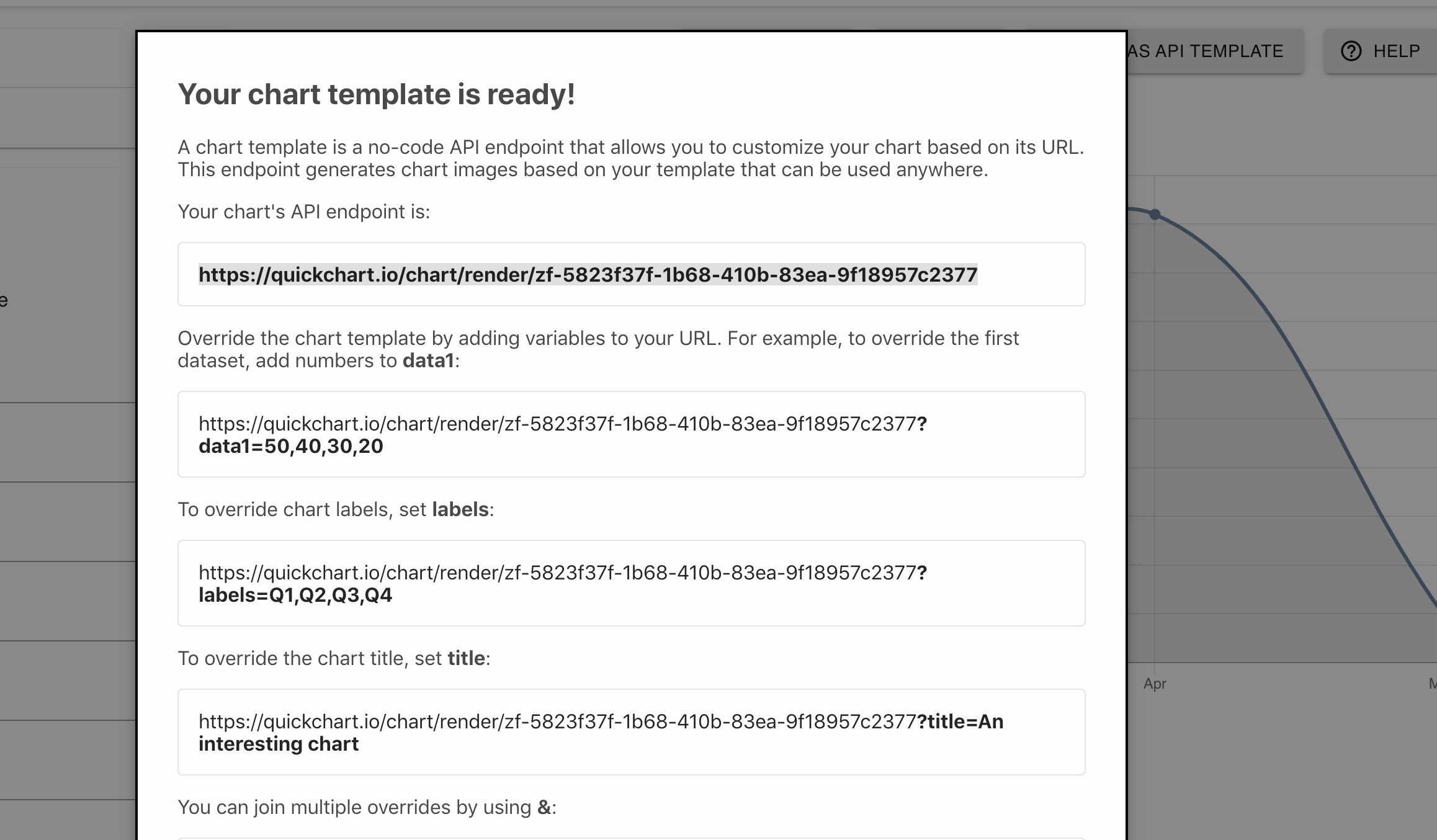
When you're done, click Save as API Template in the top right and record the API endpoint (it will look something like https://quickchart.io/chart/render/sm-abc-123).
Step 4: Add the chart to your scenario
Switching back to your Make scenario, add a new action and select the Create Chart module from the QuickChart app.
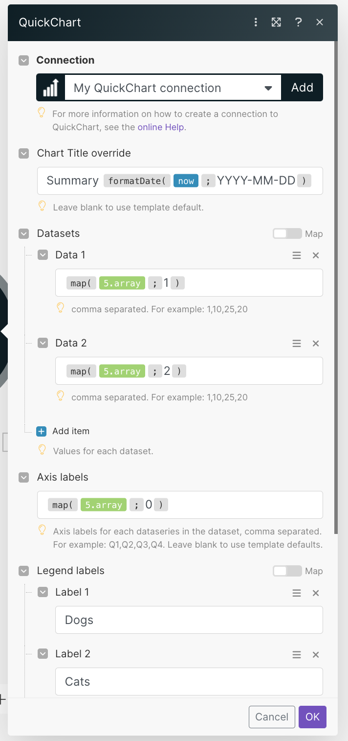
We set up each field in the QuickChart module:
Connection
Create a new QuickChart connection. You can provide an API key, or leave it blank to use the free edition.
Chart Template URL
This is the chart template that you created in the previous step. Paste in the URL here.
Chart Title
Title that appears above the chart. In this example, we add today's date using a built-in Make function:
Summary formatDate(now ; YYYY-MM-DD)
You can leave this field blank if you wish - the title shown will be whatever you put in the template, or you can hide the chart title altogether in the template..
Datasets
The actual data that appears in your chart. In this example, we use columns 1 and 2 of the spreadsheet, which are numerical values.
# Data 1
map(5.array ; 1)

# Data 2
map(5.array ; 2)
This configuration tells the QuickChart module that we have two data series derived from array index 1 and array index 2.
If you're not doing fancy stuff with array aggregators, you can just put raw data here as a comma-delimited string. For example:
# Data 1
10,20,50,80

# Data 2
105.2,103.8,97.7,40
Axis Labels
Axis labels appear under the main categorical axis (usually the X axis). In this example, we use the first column of the spreadsheet.
map(5.array ; 0)
This has the effect of pulling the names (Joe, John, Sam...) from the above example table. We want these names to appear under the data on the graph.
If the axis label setting is left blank, labels from the chart template are displayed.
Legend Labels
Legend Labels describe each dataset or series. This label appears in the chart legend, assuming your chart template contains a legend. In this example, I've chosen to label my dataseries Dogs and Cats for some reason.
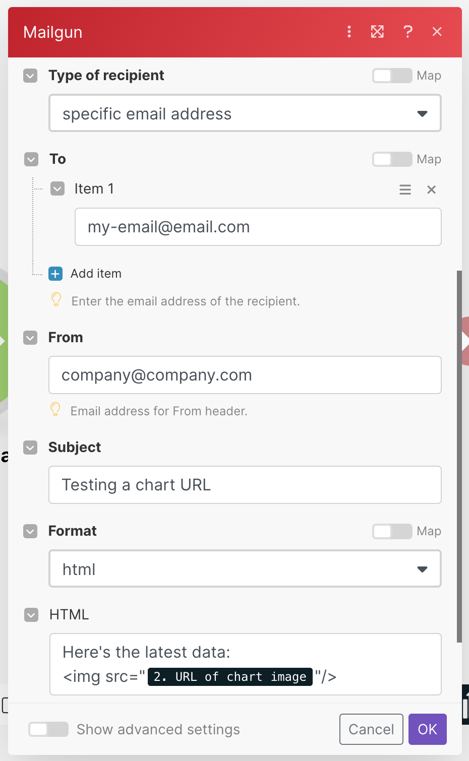
Step 5: Send the email!
In this example, we use Mailgun, a 3rd-party email service, to send an email.
The key part of this setup is including the chart in the HTML body of the email. To do so, use an <img> tag to include the chart and any HTML you desire to format the email. Here's an example HTML email body:
<p>
   Dear colleagues,
</p>
<p>
    Please review the latest numbers, included below.
</p>
<img src="2. URL of chart image" />
Put it all together
That's it! When you run the scenario, you'll get an email that contains a beautiful chart with data from your spreadsheet.
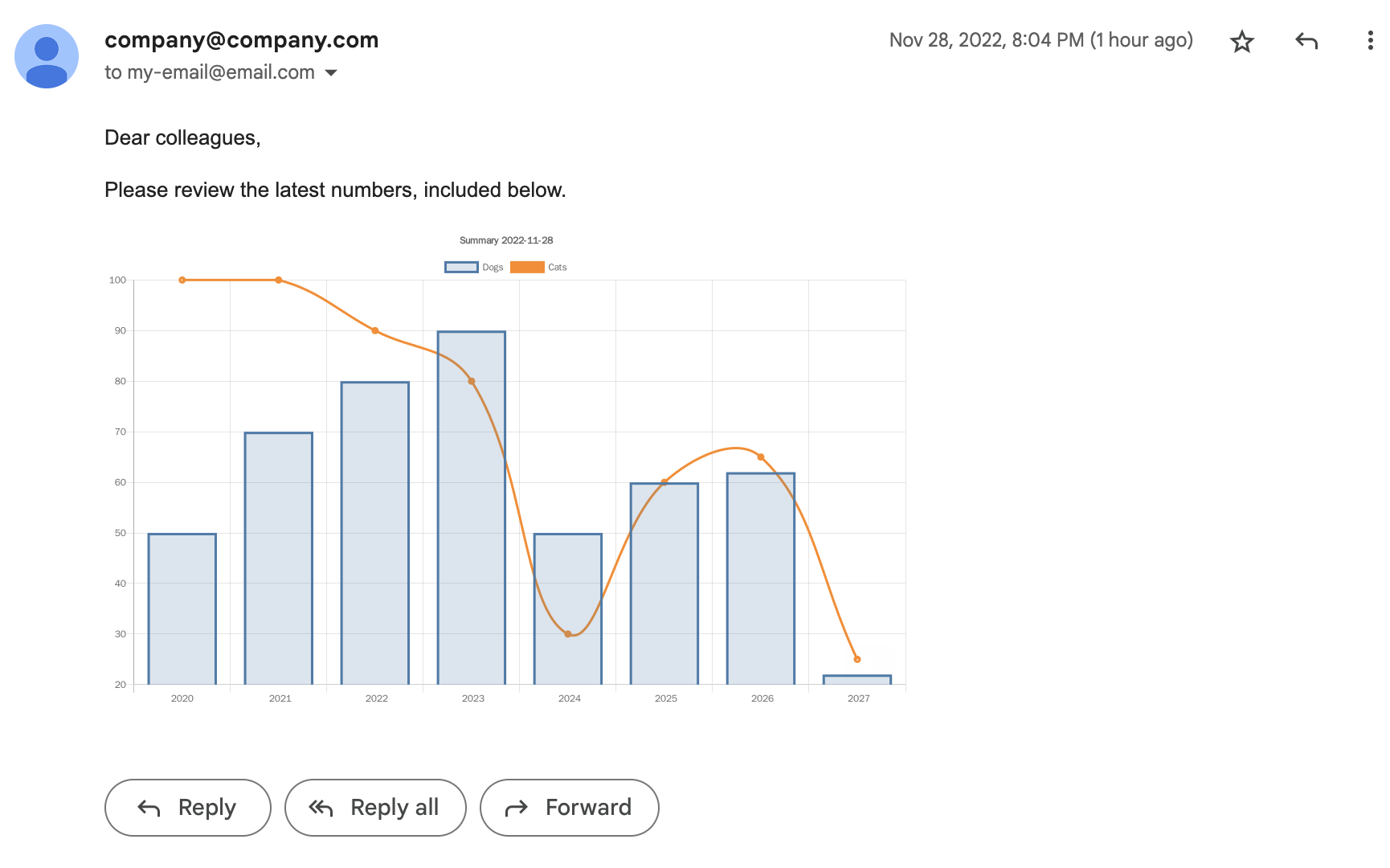
Put this scenario on a weekly timer, for example, to receive regular reports.
Need help?
In this tutorial, we learned how to create a chart from data in Zapier. Although we sent this chart in an email, the same technique could just as easily be applied to:
- Adding a chart to a Google Drive or Google Doc
- Sending the chart as a Slack message
- Tweeting the chart
Make has a lot of integrations, and you could just as easily use the following data sources:
- Airtable
- Typeform
- Salesforce
Please feel free to reach out with any new ideas or questions! Also, if you need help, check out our community where we discuss QuickChart integrations, chart configurations, and more.