Chart Types
For a variety of useful editable examples, see the chart gallery.
Changing chart types can be very simple. By changing type: bar to type: line, for example, we can instantly produce an equivalent line graph:
Bar chart
type to horizontalBar for a horizontal bar chart.Line graph
<img src="https://quickchart.io/chart?c={type:'line',data:{labels:['January','February','March','April','May'],datasets:[{label:'Dogs',data:[50,60,70,180,190],fill:false,borderColor:'blue'},{label:'Cats',data:[100,200,300,400,500],fill:false,borderColor:'green'}]}}">Radar chart
See Chart.js radar chart documentation
<img src="https://quickchart.io/chart?c={type:'radar',data:{labels:['January','February','March','April','May'],datasets:[{label:'Dogs',data:[50,60,70,180,190]},{label:'Cats',data:[100,200,300,400,500]}]}}">Pie chart
See Pie chart documentation. This chart also uses the datalabels plugin.
Learn how to customize pie chart labels.
<img src="https://quickchart.io/chart?c={type:'pie',data:{labels:['January','February','March','April','May'],datasets:[{data:[50,60,70,180,190]}]}}">Doughnut chart
See Doughnut Chart documentation. You can also use options from the Chart.js doughnutlabel plugin, in addition to the datalabels plugin.
Learn how to customize doughnut chart labels.
<img src="https://quickchart.io/chart?c={type:'doughnut',data:{labels:['January','February','March','April','May'],datasets:[{data:[50,60,70,180,190]}]},options:{plugins:{doughnutlabel:{labels:[{text:'550',font:{size:20}},{text:'total'}]}}}}">The doughnut chart type is very flexible. For example, you can use a half-doughnut to make a gauge-style chart.
<img src="https://quickchart.io/chart?c={type:'doughnut',data:{datasets:[{data:[24,66],backgroundColor:['green','#eee'],label:'Dataset1',borderWidth:0}],labels:['A','C']},options:{circumference:Math.PI,rotation:Math.PI,cutoutPercentage:75,layout:{padding:40},legend:{display:false},plugins:{datalabels:{color:'#404040',anchor:'end',align:'end',formatter:(val)=>val+'%',font:{size:25,weight:'bold'}},doughnutlabel:{labels:[{text:'\nYourstatusis',font:{size:20}},{text:'\nhealthy',color:'#000',font:{size:25,weight:'bold'}}]}}}}">Polar chart
Polar charts are like pie and doughnut charts, except each segment has the same angle and the radius of the segments varies based on the value. See Polar Area Chart documentation.
<img src="https://quickchart.io/chart?c={type:'polarArea',data:{labels:['January','February','March','April','May'],datasets:[{data:[50,60,70,180,190]}]}}">Scatter Plot
See Scatter chart documentation
<img src="https://quickchart.io/chart?c={type:'scatter',data:{datasets:[{label:'Data1',data:[{x:2,y:4},{x:3,y:3},{x:-10,y:0},{x:0,y:10},{x:10,y:5}]}]}}">Bubble chart
Bubble is similar to Scatter, except the r variable defines bubble radius in pixels. Bubble Chart documentation
<img src="https://quickchart.io/chart?c={type:'bubble',data:{datasets:[{label:'Data1',data:[{x:1,y:4,r:9},{x:2,y:4,r:6},{x:3,y:8,r:30},{x:0,y:10,r:1},{x:10,y:5,r:5}]}]}}">Radial Gauge / "Meter" Charts
View the options at chartjs-radial-gauge for customization details.
<img src="https://quickchart.io/chart?c={type:'radialGauge',data:{datasets:[{data:[70],backgroundColor:'green'}]}}">Speedometer Charts
See customization options at chartjs-gauge.
<img src="https://quickchart.io/chart?c={type:'gauge',data:{datasets:[{value:50,data:[20,40,60],backgroundColor:['green','orange','red'],borderWidth:2}]},options:{valueLabel:{fontSize:22,backgroundColor:'transparent',color:'#000',formatter:function(value,context){returnvalue+'mph';},bottomMarginPercentage:10}}}">Box Plots and Violin Charts
You can use violin, boxplot, horizontalBoxPlot, and horizontalViolin chart types. View the options at chartjs-chart-box-and-violin-plot for customization details.
<img src="https://quickchart.io/chart?c={type:'violin',data:{labels:[2012,2013,2014,2015],datasets:[{label:'Data',data:[[12,6,3,4],[1,8,8,15],[1,1,1,2,3,5,9,8],[19,-3,18,8,5,9,9]],backgroundColor:'rgba(56,123,45,0.2)',borderColor:'rgba(56,123,45,1.9)'}]}}">For best results, add a scatter plot to your box or violin chart.
Funnel Charts
QuickChart supports funnel charts (aka pyramid charts) using chartjs-chart-funnel for Chart.js version 3+. See an example configuration.

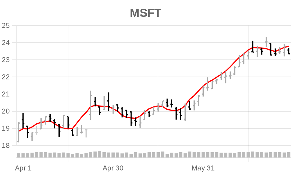
Financial Charts
QuickChart supports Candlestick and OHLC charts using the chartjs-chart-financial plugin. These are commonly used for technical analysis and stock charts.
Note that you'll have to select Chart.js version 3+ to use these plugins. View example configuration
Sparklines
A sparkline is a special case of line graph with axes and other labeling removed. All line graph options can be applied. Read more about the sparkline API.
<img src="https://quickchart.io/chart?c={type:'sparkline',data:{datasets:[{data:[140,60,274,370,199]}]}}">Sankeys
A sankey diagram is a flow diagram that illustrates the proportions between various stages of a flow. To learn more, see chartjs-chart-sankey documentation.
<img src="https://quickchart.io/chart?c={type:'sankey',data:{datasets:[{data:[{from:'StepA',to:'StepB',flow:10},{from:'StepA',to:'StepC',flow:5},{from:'StepB',to:'StepC',flow:10},{from:'StepD',to:'StepC',flow:7}]}]}}">A more elaborate sankey example with custom colors and position is available here.
Progress bars
A progress bar is a special case of a horizontal bar chart with axes and other labeling removed. All bar options can be applied.
The first dataset specifies the number shown. By default, this number is a percentage and the total value is 100. If your data is not out of 100, add a second dataset to override the total.
<img src="https://quickchart.io/chart?c={type:'progressBar',data:{datasets:[{data:[50]}]}}">Mixed charts
Combine charts together by specifying multiple types:
<img src="https://quickchart.io/chart?c={type:'bar',data:{labels:['January','February','March','April','May'],datasets:[{label:'Dogs',data:[50,60,70,180,190]},{label:'Cats',data:[100,200,300,400,500]},{type:'line',fill:false,label:'Potatoes',data:[100,400,200,400,700]}]}}">More examples
Additional chart examples are available in the Chart Gallery.